
It is easy to assume that more realism is always better when you make a fake receipt, but that is not quite right. The correct amount of realism depends entirely on what the receipt is for. Over polishing a tiny on screen element wastes time, while under polishing a prop the camera holds close gets it noticed. The skill is matching the effort to the scrutiny the receipt will actually face. Here is how to judge it.
Realism is a dial, not a switch
Think of realism as a dial you turn up or down based on one question: how closely will this receipt be examined? A receipt glimpsed for a moment in the background of a screenshot needs far less than one a viewer can freeze and zoom into, or one printed and physically handled. Spending an hour perfecting the ink texture on a thumbnail nobody will enlarge is wasted effort. Skipping that texture on a hero prop is a visible mistake. The goal is appropriate realism, not maximum realism.
Low scrutiny: get the basics right
For receipts that will only be seen small, briefly or in the background, the essentials are enough. Start from an accurate template so the layout reads correctly, keep the totals reconciled so the math does not betray it on a second glance, and make sure the content is plausible. You can skip the heavy physical realism, because at that size and exposure it will not be noticed anyway. This covers a lot of design mockups, background props and quick illustrations.
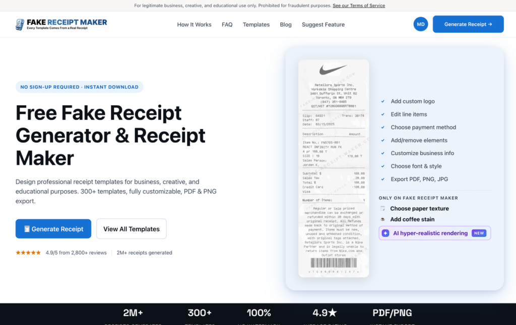
For this tier, a fast tool is ideal, and Fake Receipt Maker fits well, with its three step flow and quick export getting you a clean, accurate receipt without time spent on touches that will not show.
Medium scrutiny: add believable detail
For receipts that will be seen clearly but not forensically, a demo screen a prospect explores, a training example, a blog illustration, turn the dial up. Now the brand specific format details matter, so include the rewards line, the pump number, the loyalty savings as appropriate. Add light realism if the receipt is shown at a reasonable size. Vary the content if it appears alongside others. The receipt should reward a normal look without necessarily surviving a magnifying glass.
High scrutiny: the full realism set
For receipts that will be examined closely, photographed, frozen on screen or printed and handled, turn the dial all the way up. Here every detail counts: an accurate base template, bulletproof math, plausible context, full brand specific formatting, and the complete physical realism set of paper texture, wear and ink variation.

This is where Online Receipt Maker earns its place, because its real layout templates plus the texture and hyper realistic rendering options are built precisely for receipts that have to survive a close look. For a camera prop or a high fidelity asset, this level of detail is the difference between convincing and exposed.
A simple reference for the three tiers
If it helps to have the levels spelled out, here is the quick version. At the low tier, for background or small on screen use, you need an accurate template and reconciled math, and nothing more, because no one will look closely enough for the rest to register. At the medium tier, for demos, training examples and blog illustrations seen clearly but not forensically, add the brand specific format details and light physical realism, and vary the content if several appear together. At the high tier, for camera props, prints and anything frozen or handled, use the complete set: accurate base, bulletproof math, plausible context, full brand formatting and the physical realism of texture, wear and ink variation. Place your job on that scale first and the right amount of effort becomes obvious before you start.
A common mistake in both directions
People err on both sides of this. Some over polish everything, sinking time into texture and ink on a receipt that will appear as a thumbnail, which is effort the viewer never sees. Others under polish, treating a hero prop the camera will linger on like a throwaway mockup, which gets it noticed for the wrong reasons. Neither is fatal, but both waste something, either your time or your credibility. The fix is the same in both cases: decide the scrutiny level honestly before you build, and resist the urge to either gold plate a minor element or cut corners on a prominent one.
A simple way to decide
Before you start, picture the worst case viewing condition the receipt will face and design for that. If the answer is a quick glance in a small image, keep it simple and fast. If it is a freeze frame, a print or a hands on inspection, use the full realism set. When unsure, lean slightly toward more realism, since the cost of a little extra effort is small while the cost of an exposed prop is the whole shot. But do not reflexively max everything out, because matching effort to need is part of working efficiently.
A note on legitimate use
Calibrating realism is a craft consideration for legitimate work like props, mockups, demos, training and illustration. Both sites state their legitimate use only positioning openly on their own pages and prohibit using a realistic receipt to deceive anyone in a real transaction. Choosing the right level of detail is about doing honest creative and professional work well, nothing more.
Bottom line
How realistic a fake receipt needs to be depends on how closely it will be examined, not on a fixed standard. Match the dial to the job: basics for low scrutiny background use, believable detail for medium visibility, and the full realism set for anything frozen, printed or inspected up close. Picture the toughest viewing condition the receipt will face, design for that, and you will spend your effort exactly where it shows and nowhere it does not.